As announced on MTV blogs, the upcoming NEW MOON movie now has a NEW NAME. Well, not quite new, actually it’s the same name but now with ‘The Twilight Saga’ added to the beginning of the logo art:

People have been asking my opinion on the longer logo and why it was changed from just NEW MOON. While I don’t have an exact nor official answer, I do have my own theories.
Followers of my site might recall that the full title of my book is Bran Hambric: The Farfield Curse, and this follows the same concept I think they are using for New Moon. In my case, BRAN HAMBRIC is the name of the series, and THE FARFIELD CURSE is the name of the specific book in the series (for example, the second book might be called Bran Hambric: The Lofty Pantaloons or similar). This is the same with almost any series of books or films these days, and is basically a good marketing technique as it connects each movie or book back to one main concept (like, every Harry Potter having Harry Potter in the title; every Percy Jackson book having Percy Jackson in the title; and now every Twilight Saga movie having Twilight somewhere in the art).
The fact is, the most recognizable book in the series is Twilight: people always remember the hands and the apple, and the extra-tall letter L. So, by putting Twilight into the art of this poster, all the people who are only fans of the films will connect the films together, and go watch it.
Plus, The Twilight Saga isn’t actually going into the full official title: it’s just there for the less-dedicated fans (like in Star Wars: the films were referred to A New Hope / Return of the Jedi, but were actually officially titled Star Wars: A New Hope, etc.). However, this leads to the question: does it actually look good in the new way? Does the gold really stand out enough and make the movie unique?
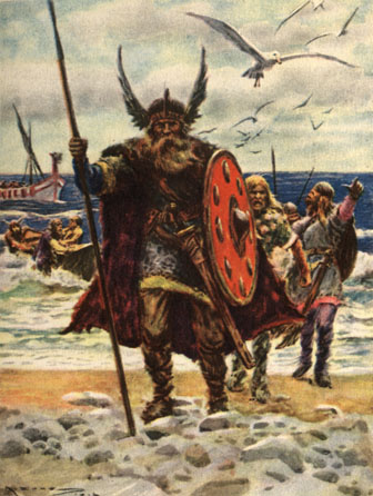
I will be honest about certain flaws I see in this logo. For one, it is ginormous, with not one, not two, but four layers (The Twilight Saga, New Moon, the Moon device, and the release date). With Twilight, everything was wonderful and compact. I’ve worked in graphic design for years, and I know that a compact logo is far better than a big and bulky one. Also, I loved the mysterious blue for Twilight: the New Moon logo seems stronger, deeper, almost like it might be a new movie about Vikings

On the other hand, though, they were really smart in regards to the marketing I mentioned above: and with the budget they’re putting into this film, I have little doubt they did all of this for a reason. Keep in mind that New Moon focuses greatly upon Jacob Black, and I have a feeling that the gold here was made to contrast as deeply as possible with the blue in the previous film. Edward and vampires are more mysterious and cold: Jacob and the werewolves are more strong and warm. Compare the color schemes for the two films. Now it makes more sense!
Question for the comments: What do YOU think about the new logo for New Moon?
103 Responses
Howdy I am so thrilled I found your webpage, I really found you by mistake, while I was browsing on Askjeeve for something else, Nonetheless I am here now and would just like to say thanks for a remarkable post and a all round interesting blog (I also love the theme/design), I dont have time to read through it all at the moment but I have bookmarked it and also added in your RSS feeds, so when I have time I will be back to read a lot more, Please do keep up the great job.
What i do not understood is actually how you are not actually much more well-liked than you may be right now. You are very intelligent. You realize thus significantly relating to this subject, produced me personally consider it from so many varied angles. Its like women and men aren’t fascinated unless its one thing to do with Lady gaga! Your own stuffs nice. Always maintain it up!
Hi, i think that i saw you visited my weblog thus i came to return the favor.I’m attempting to find things to enhance my website!I suppose its ok to use some of your ideas!!